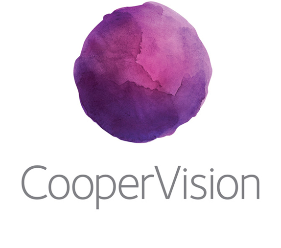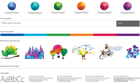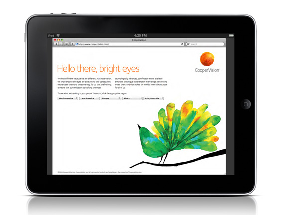
The new watermark logo was designed to represent a blend of scientific precision with the vibrancy found in everyday experiences. The spectrum of colors and fluid nature of the design reinforces CooperVision's perspective that the world is a vibrant, ever-changing place. It also provides a unique take on water and comfort—valuable qualities of the CooperVision lenses that are key ingredients in their wearers' daily lives.
Role—Designer: Typographic lockup, collateral, visual system
Design & Creative Direction—Keith Venkiteswaran
Design Director—Michelle Matthews